
[ CASE STUDY ]
CALM BEFORE THE STORK
Website for Baby Gear Consultants
Scroll to View the Case Study ↓
Project Objective
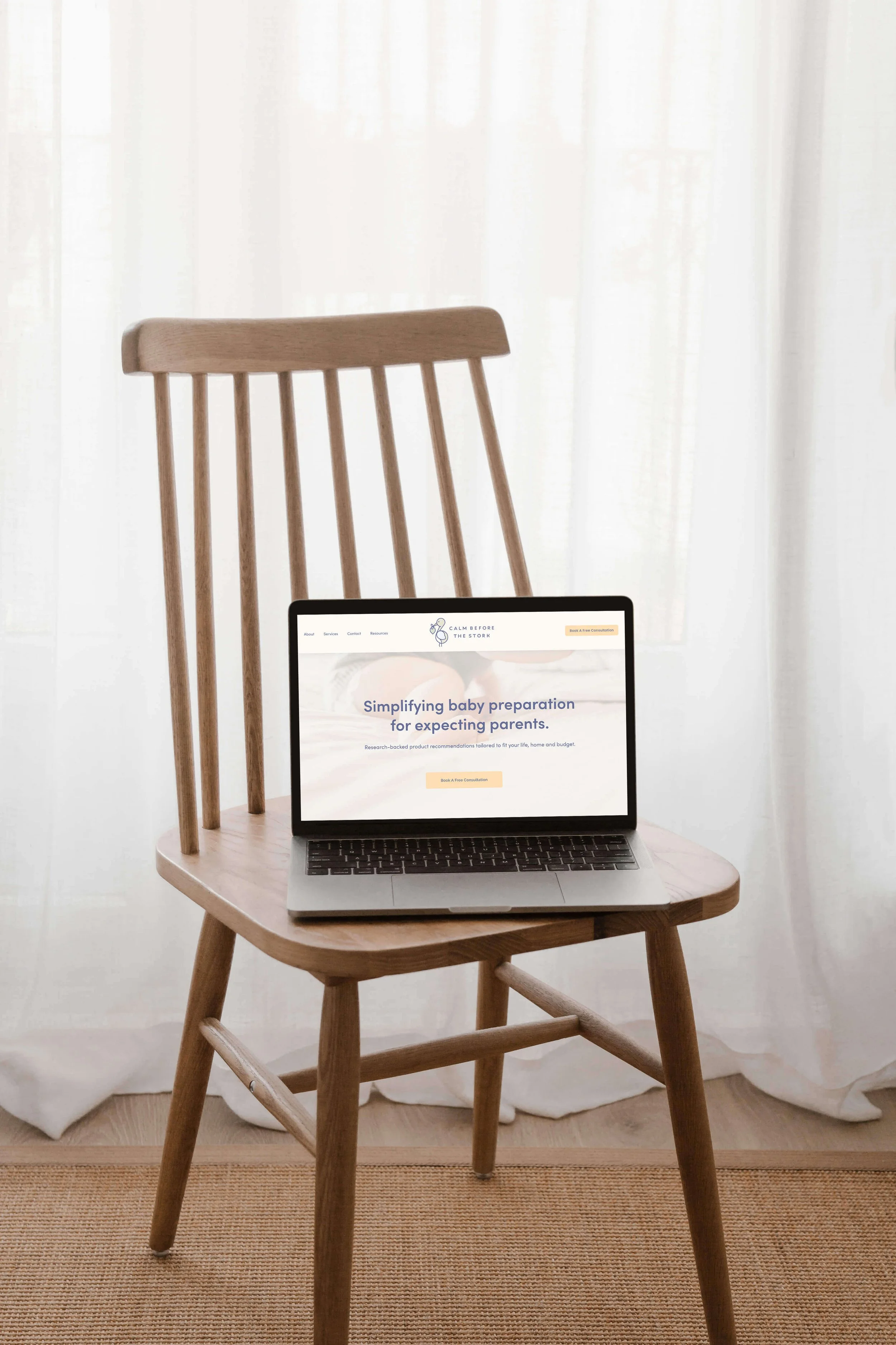
Reducing parental overwhelm for Calm Before the Stork with a trustworthy, supportive visual identity and landing page.
What We Built
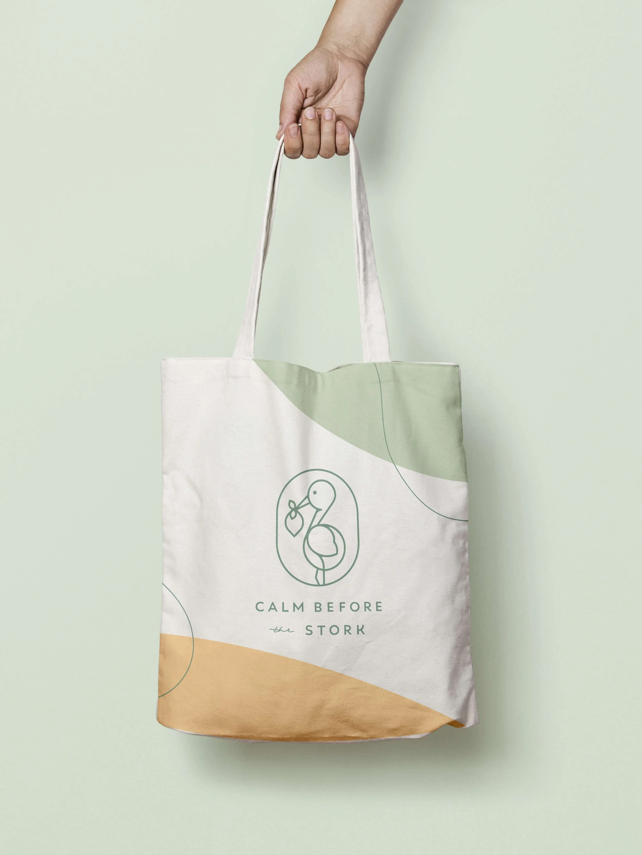
Visual Identity
Done-For-You Copy
Squarespace Web Design
Messaging Strategy
Project Details
Platform: Squarespace
Industry: Lifestyle Consulting
Launch Date: 2023
Brand Brief
Ariel, the founder of Calm before the Stork, recognized that expecting parents are drowning in product options. Her early-stage consulting business needed an online presence that immediately dissolved anxiety and established deep, clinical trust.
Creative Direction
Minimal Layout
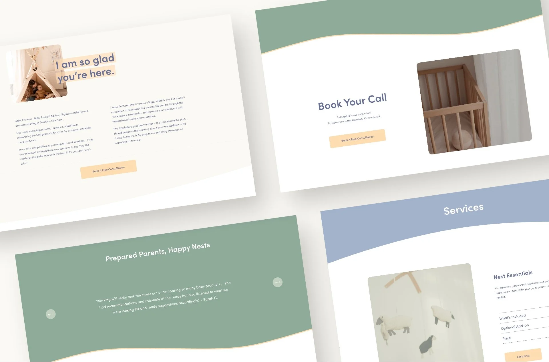
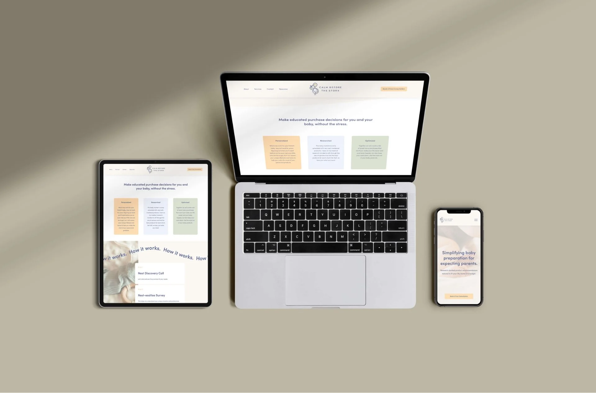
Minimized cognitive load for exhausted parents with a single, seamless landing page rather than a complex multi-page site.
Calm, Concise Copy
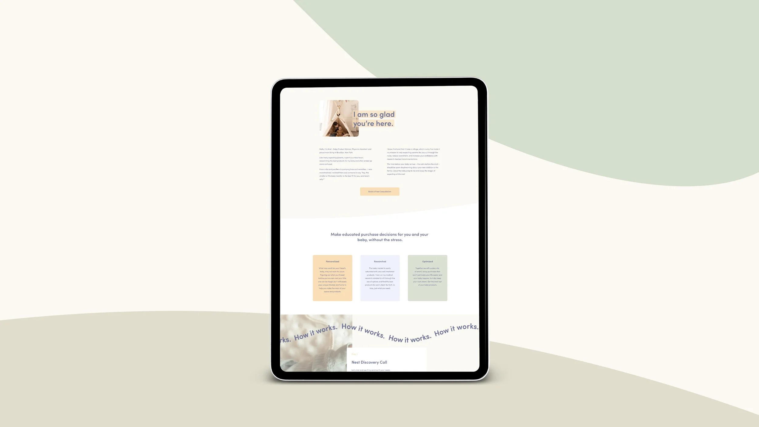
Stripped the copy down to its absolute essentials to create a clean narrative path with a singular, zero-friction call to action.
Nurturing Aesthetic
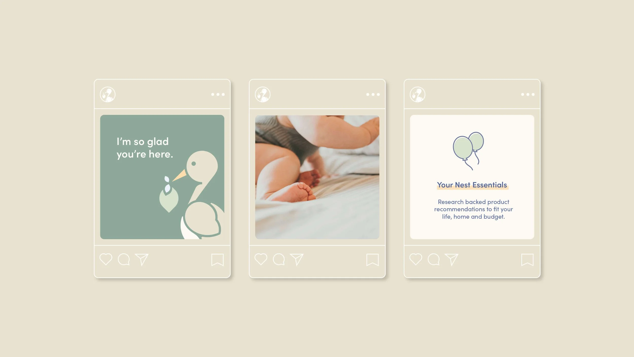
Utilized an inviting palette of warm spring hues and ample white space to dissolve anxiety and establish trust.
“You both have been so wonderful to work with and I can't wait to see the final product! Thanks for all of your hard work and guidance thus far.”
— Ariel, Founder of Calm Before the Stork“

-
Because Calm Before the Stork is a specialized startup utilizing a direct consultation model, we bypassed a complex multi-page ecosystem in favour of a seamless, high-impact landing page. This architectural decision was entirely centered around reducing cognitive load for an already exhausted target audience.
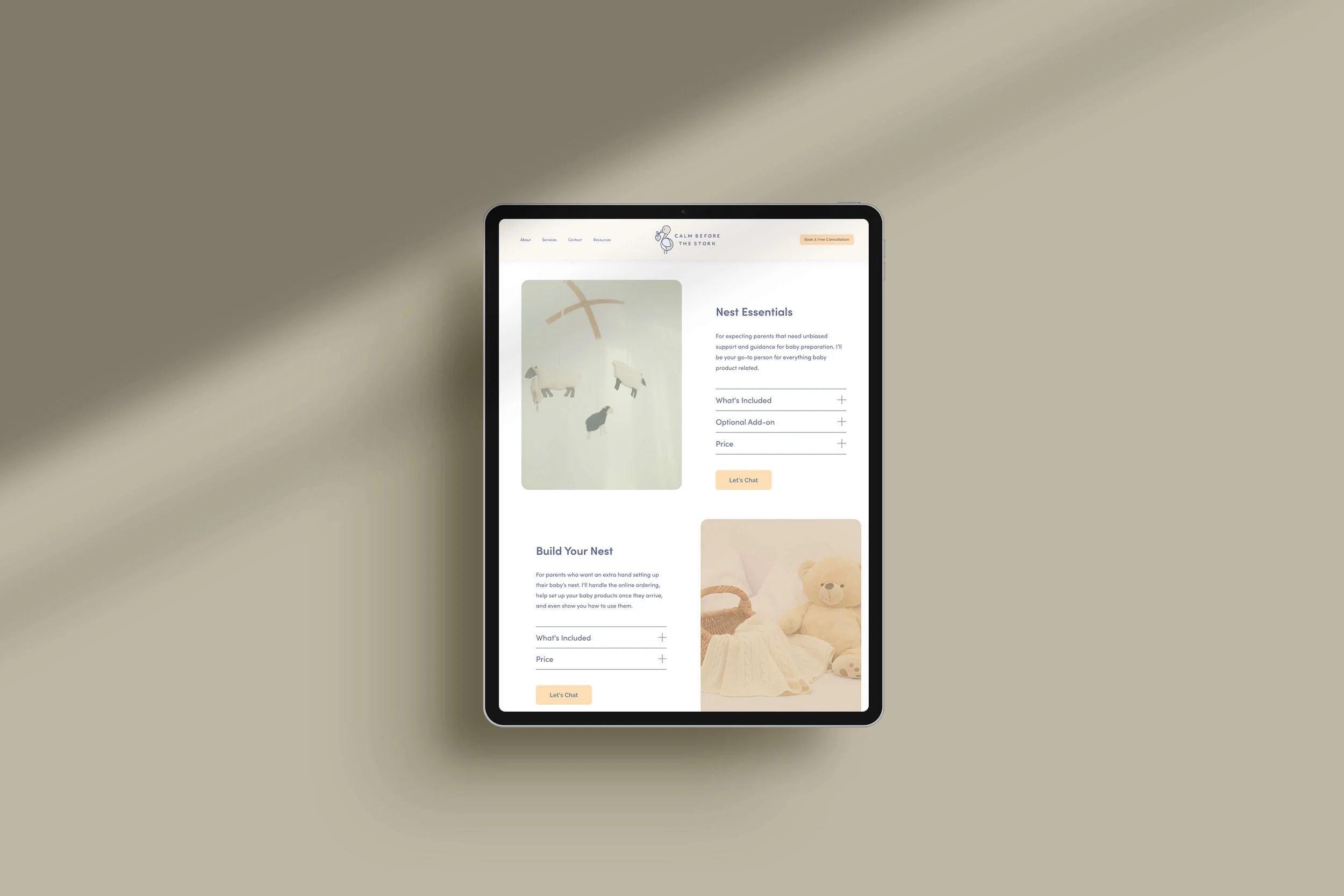
The website copy was stripped down to its absolute, high-value essentials—offering an inviting entry point to her brand, a clear breakdown of her consultative services, and a singular, zero-friction call to action. On the visual front, the identity pulls inspiration from the family lifestyle space, utilizing a sophisticated palette of warm greens, muted yellows, and inviting blues to establish immediate comfort.
-
To keep the digital build anchored to Ariel's core mission, we developed an internal vocabulary framework to guide every design and copywriting choice:
The Brand Vibe // Trustworthy, supportive, educational, encouraging, and highly accessible.
The Emotional Landscape // Warm, inviting, and peaceful—acting as an immediate relief to parental anxiety.
The Brand in a Word //Supportive.
The Strategic Narrative // Moving the client's audience from a state of anxious confusion to absolute preparation and peace of mind.
-
This project came through my strategic partner, Bernedette Teo who runs a fantastic marketing consultancy studio. She brought me on board and handled the brand strategy and copy. I built out the visual identity and website.