
[ CASE STUDY ]
RISE FAMILY CHIROPRACTIC
Brand for Nervous System-Focused Chiropractors
Scroll to View the Case Study ↓
Project Objective
Empowering the community for Rise Family Chiropractic with a scalable visual system and a grounded, hopeful brand identity.
What We Built
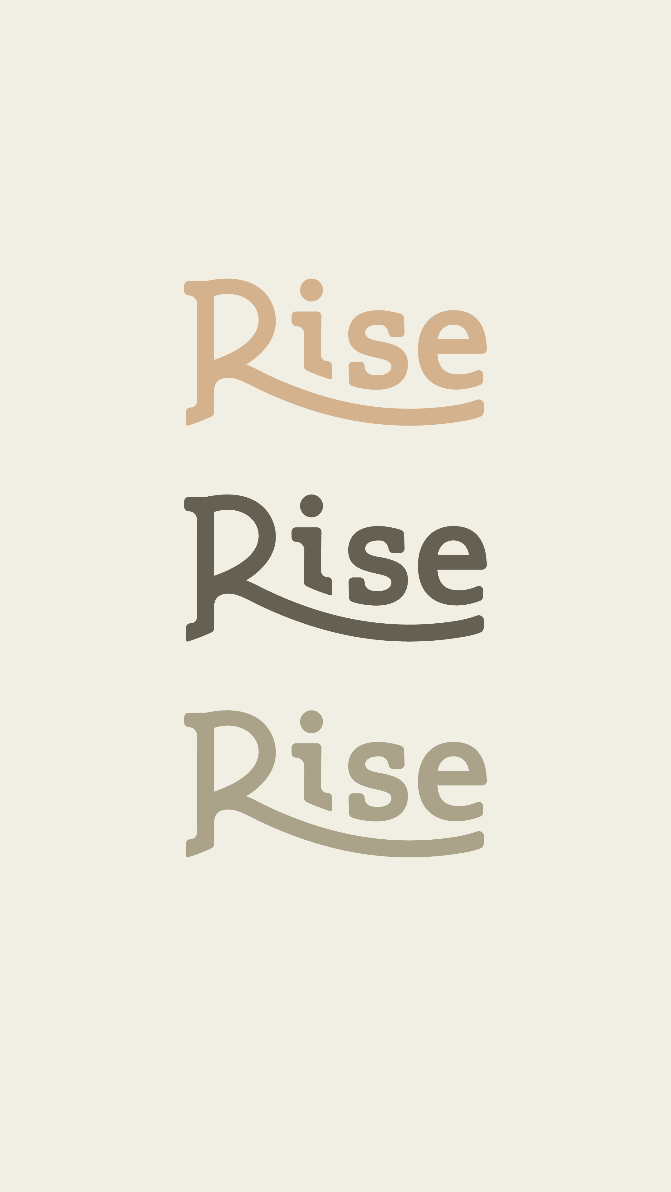
Visual Identity
Social Media Templates
Brand Guidelines
Canva Tutorial
Project Details
Industry: Holistic Health
Launch Date: 2023

Brand Brief
Dr. Daryn and Dr. Claire, the founders of Rise, recognized that young families need a grounded approach to health. Their new clinic needed a visual identity that felt true to their vision, spoke to their ideal audience, and would seamlessly scale through continued growth cycles.
Creative Direction
Scalable Layout
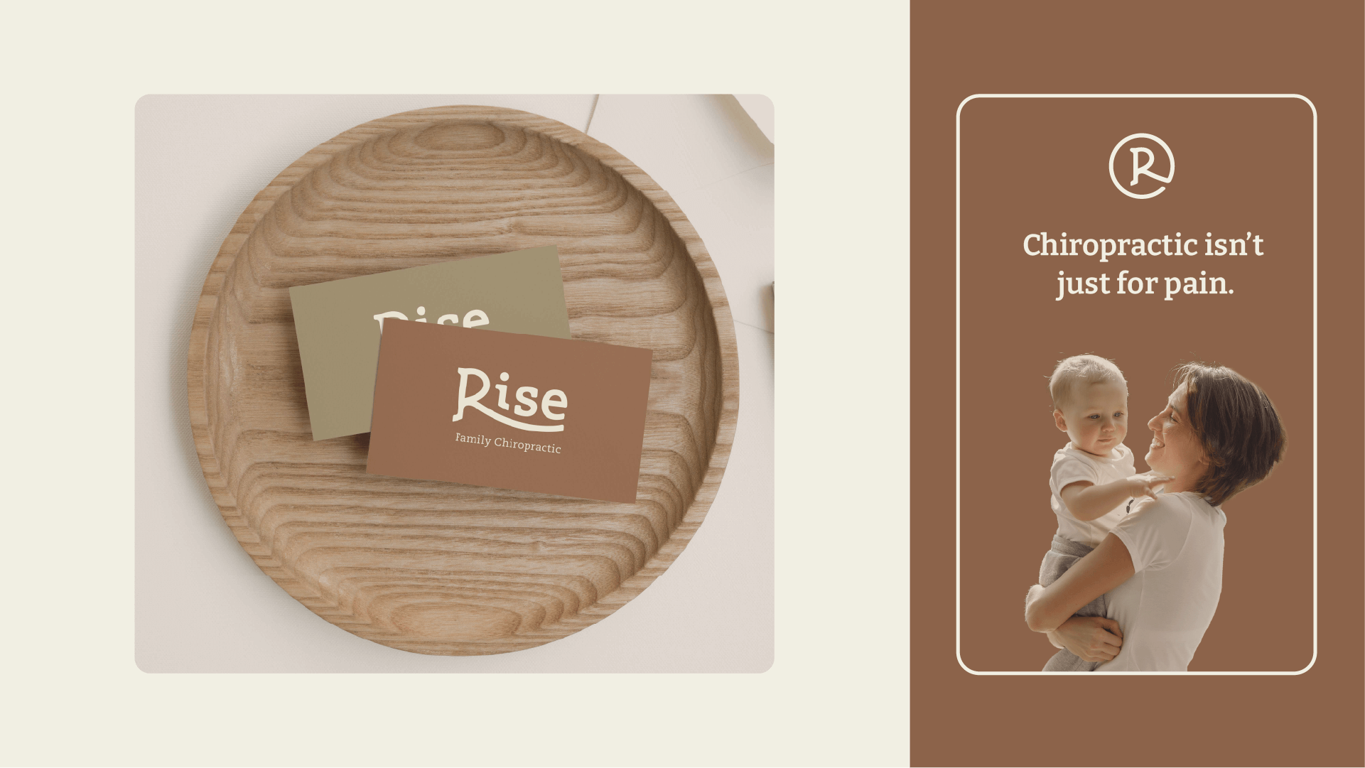
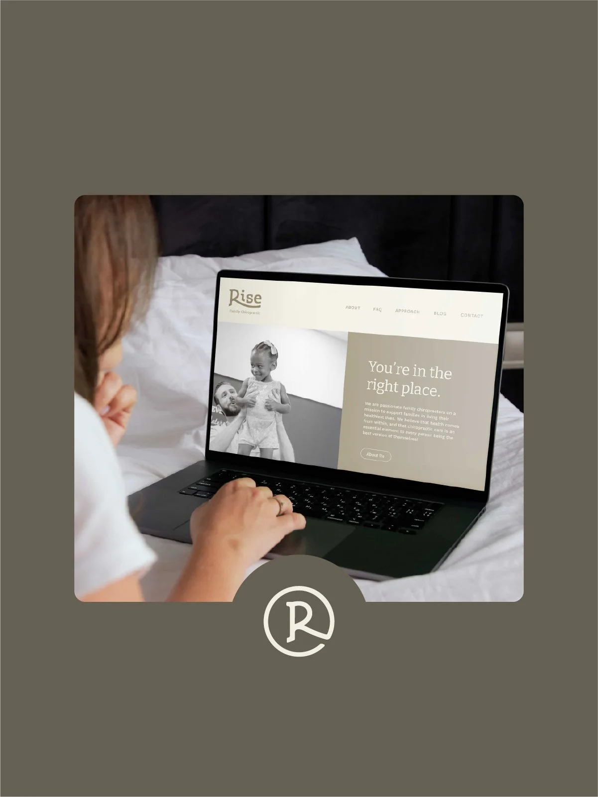
Streamlined the brand's visual identity with clean, straightforward typography to empower the owners to effortlessly manage their own marketing.
Serene Aesthetic
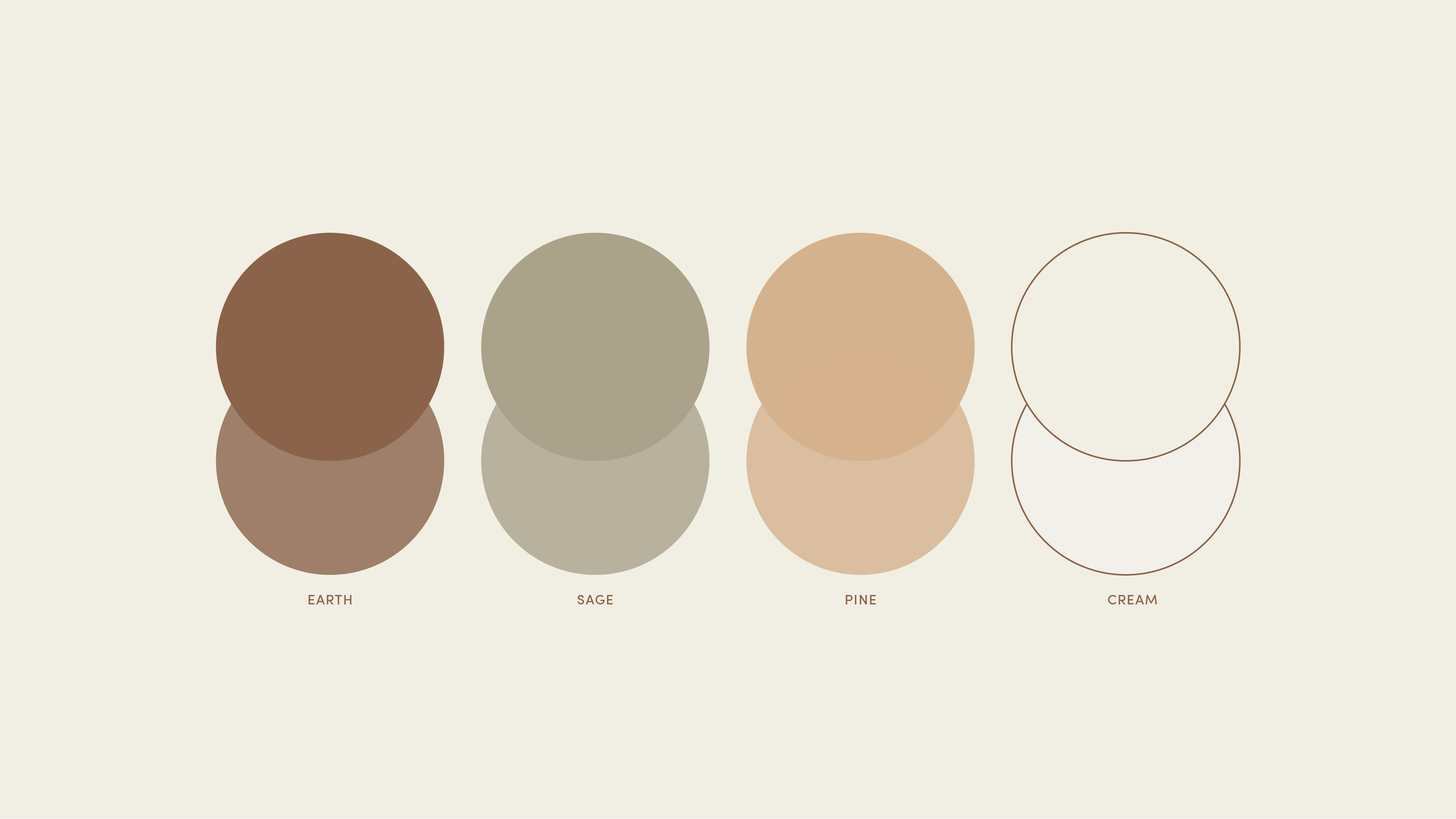
Grounded the brand in an organic palette of serene, sunset hues to strike a delicate balance between clinical calm and warm hope.
Community-Focused Copy
Centered the messaging framework around family values and nervous system healing to foster an immediate sense of lightness and familiarity.
“We are obsessed with your work. We love it!”
— Dr. Claire, Co-Founder of Rise“
-
Because Rise Family Chiropractic is a community-centered startup utilizing a holistic healing model, we bypassed the clinical/corporate look in favour of a holistic, family friendly visual system. This creative decision was centered around creating a sense of lightness and familiarity for young families seeking pediatric care.
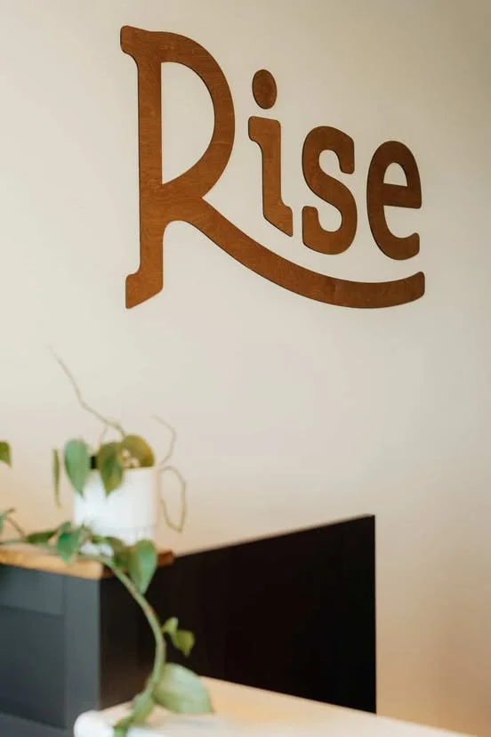
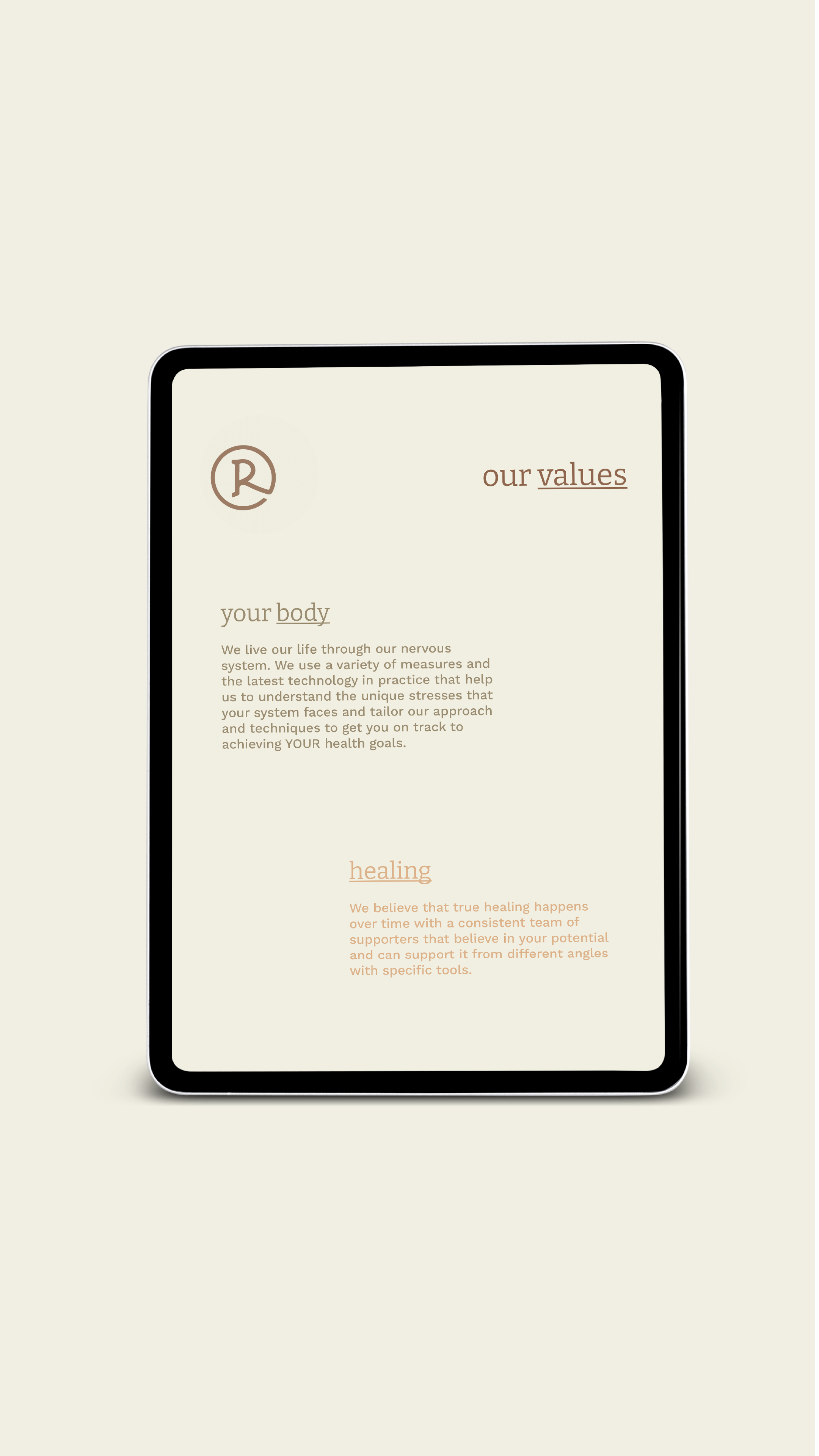
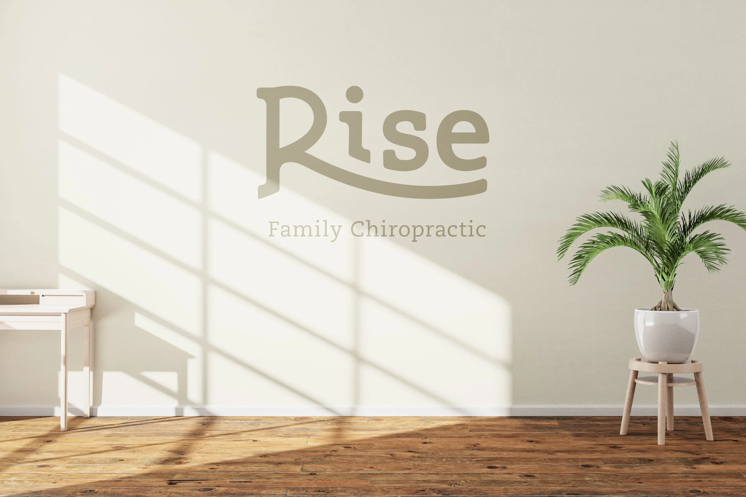
The visual assets were designed to offer an inviting entry point to their physical clinic, a clear breakdown of their functional brand assets, and a user-friendly social media toolkit. On the aesthetic front, the identity pulls inspiration from the natural lifestyle space, utilizing a sophisticated palette of warm sunset tones and serene hues to establish immediate comfort.
-
To keep the brand build anchored to the doctors' core mission, we developed an internal vocabulary framework to guide every design and copywriting choice:
The Brand Vibe // Compassionate, hopeful, warm, community-driven, and highly accessible.
The Emotional Landscape // Safe, inviting, and peaceful—acting as an immediate relief to traditional clinical anxiety.
The Brand in a Word // True health care.
The Strategic Narrative // Moving the client's audience from a state of physical stress to absolute alignment and community connection.
-
This project came through a direct collaboration with the founders of Rise Family Chiropractic during their clinic launch. They brought me on board to handle the comprehensive brand strategy, while I built out the visual identity, typography systems, and social media guidelines.