
[ CASE STUDY ]
THE HOTROOM
Yoga Studio Website Redesign & Brand Refresh
Scroll to View the Case Study ↓
Project Objective
Modernizing the digital presence for The Hotroom with a balanced visual identity to attract new students and drive teacher certifications.
What We Built
Creative Direction
Visual Identity
Web Design
Project Details
Website Platform: Wix
Industry: Health & Wellness
Launch Date: 2021
Brand Brief
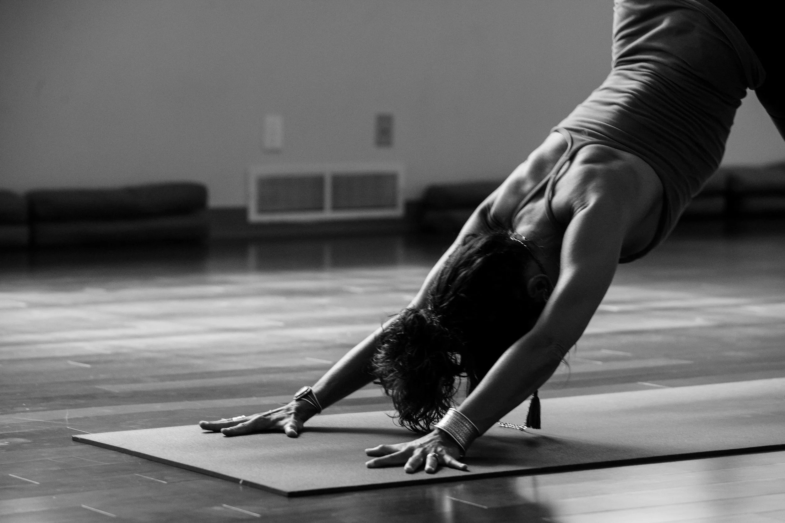
Michélè, the owner of The Hotroom, recognized that her 7-year-old digital presence needed a refresh. Her long-established studio needed an updated online experience that captured the transformative power of hot yoga while appealing to a younger demographic interested in teacher training
Creative Direction
Streamlined Layout
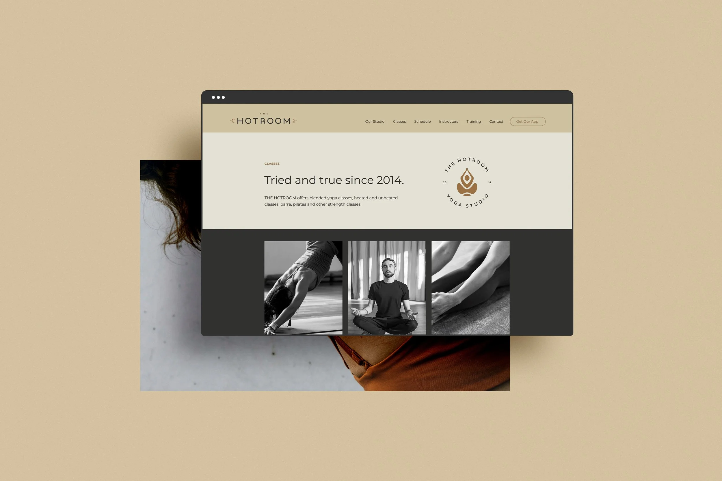
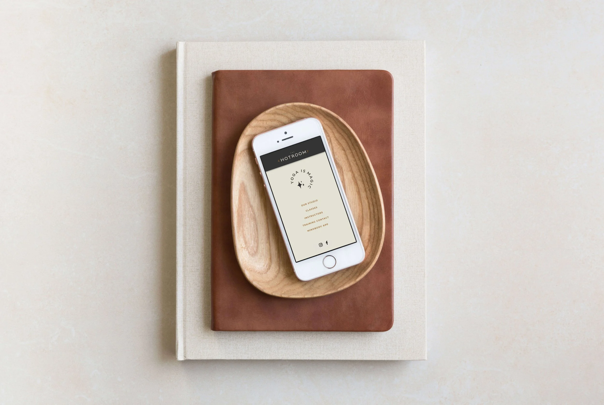
Fostered inner peace amidst external chaos with a simple, high-impact one-page website designed for easy class booking and zero friction.
Transformative Aesthetic
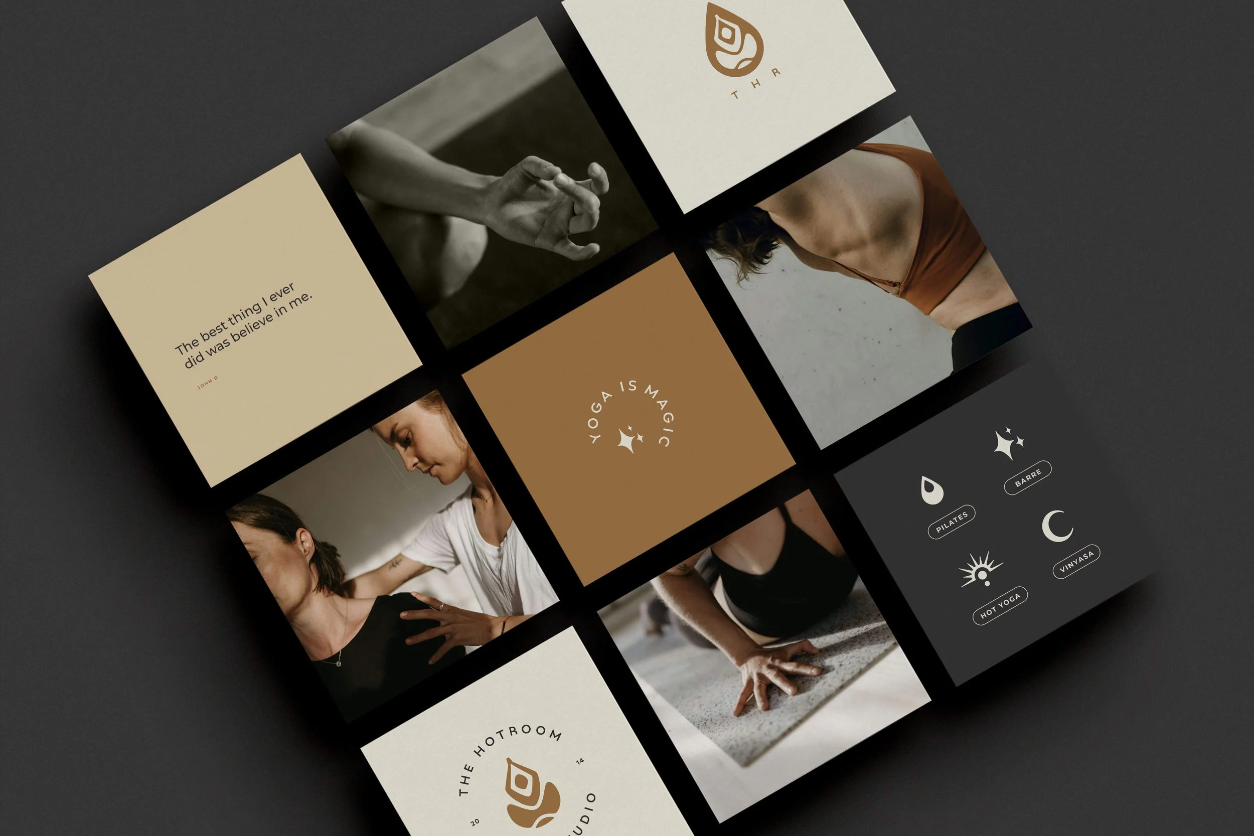
Incorporated elements reflecting the 'hot' yoga experience, utilizing warm, calming colors and imagery to draw individuals closer to the mat.
Modern, Welcoming Copy
Infused a contemporary touch into the studio's core narrative, highlighting credentials to build deep trust with both seasoned and new students.
“I was so excited that what I truly wanted came into existence without me doing all the work... It really represents myself and the studio perfectly.”
— Michélè H., Owner of The Hotroom“
-
Because The Hotroom is a long-established community hub utilizing an active class-based model, we bypassed a complex multi-page ecosystem in favour of a seamless, high-impact landing page. This architectural decision was entirely centered around reducing scheduling friction for an expanding, busy target audience.
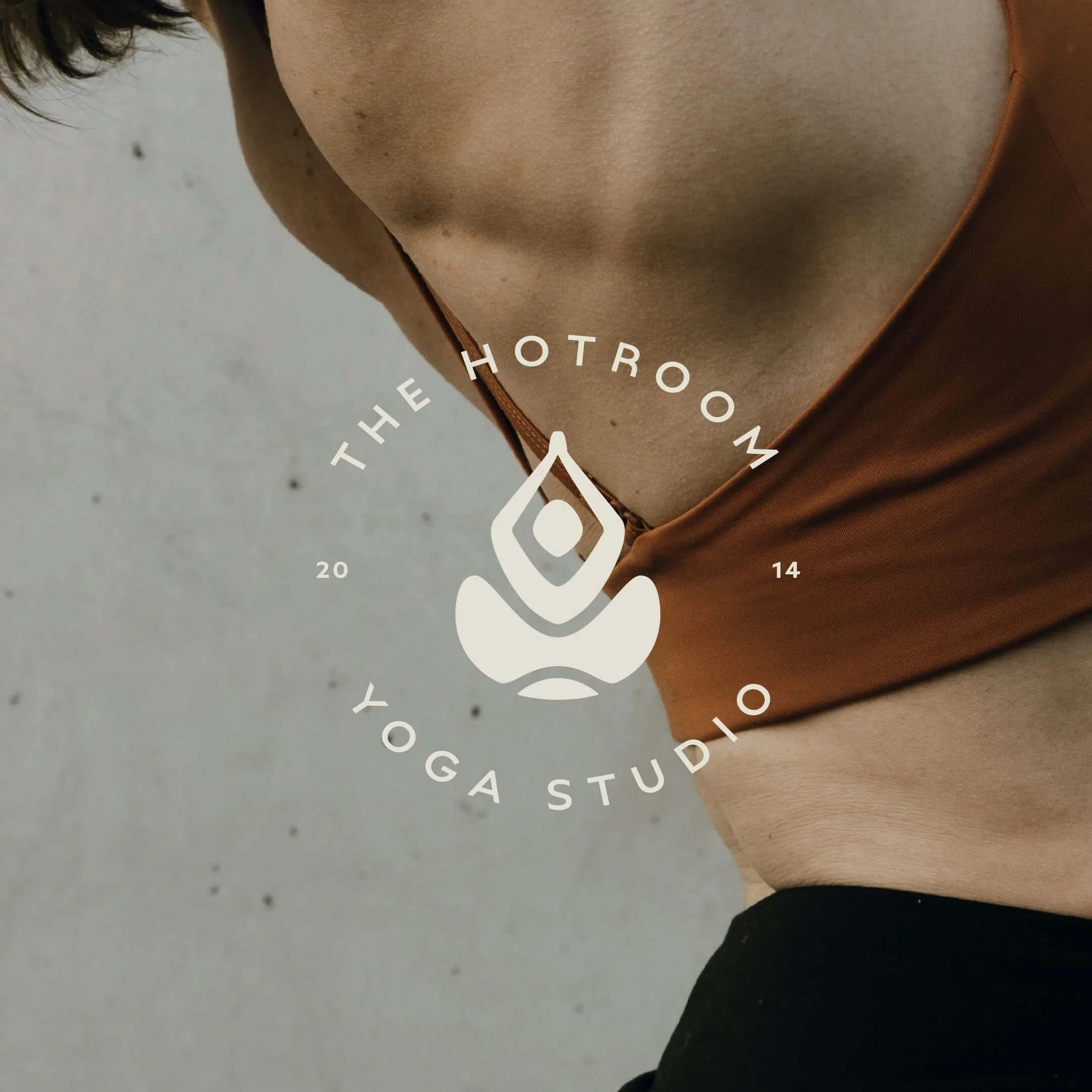
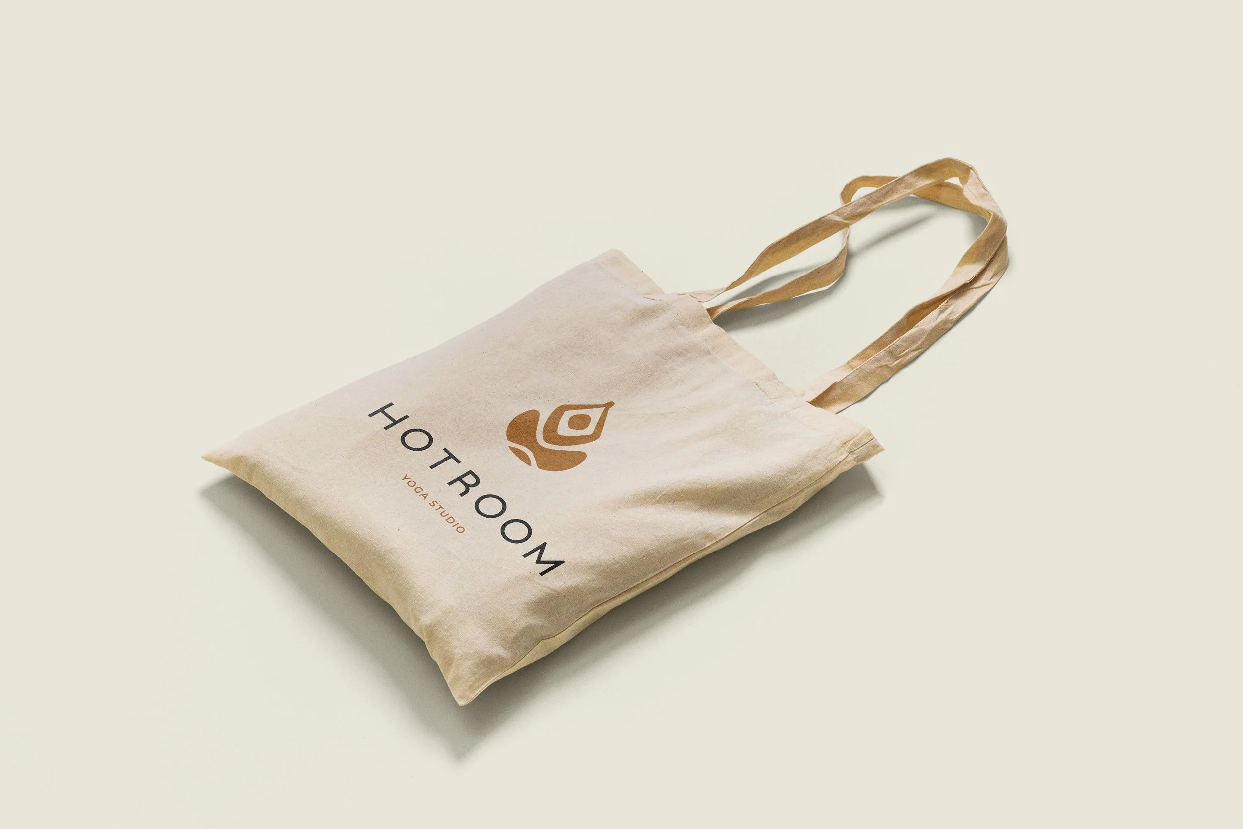
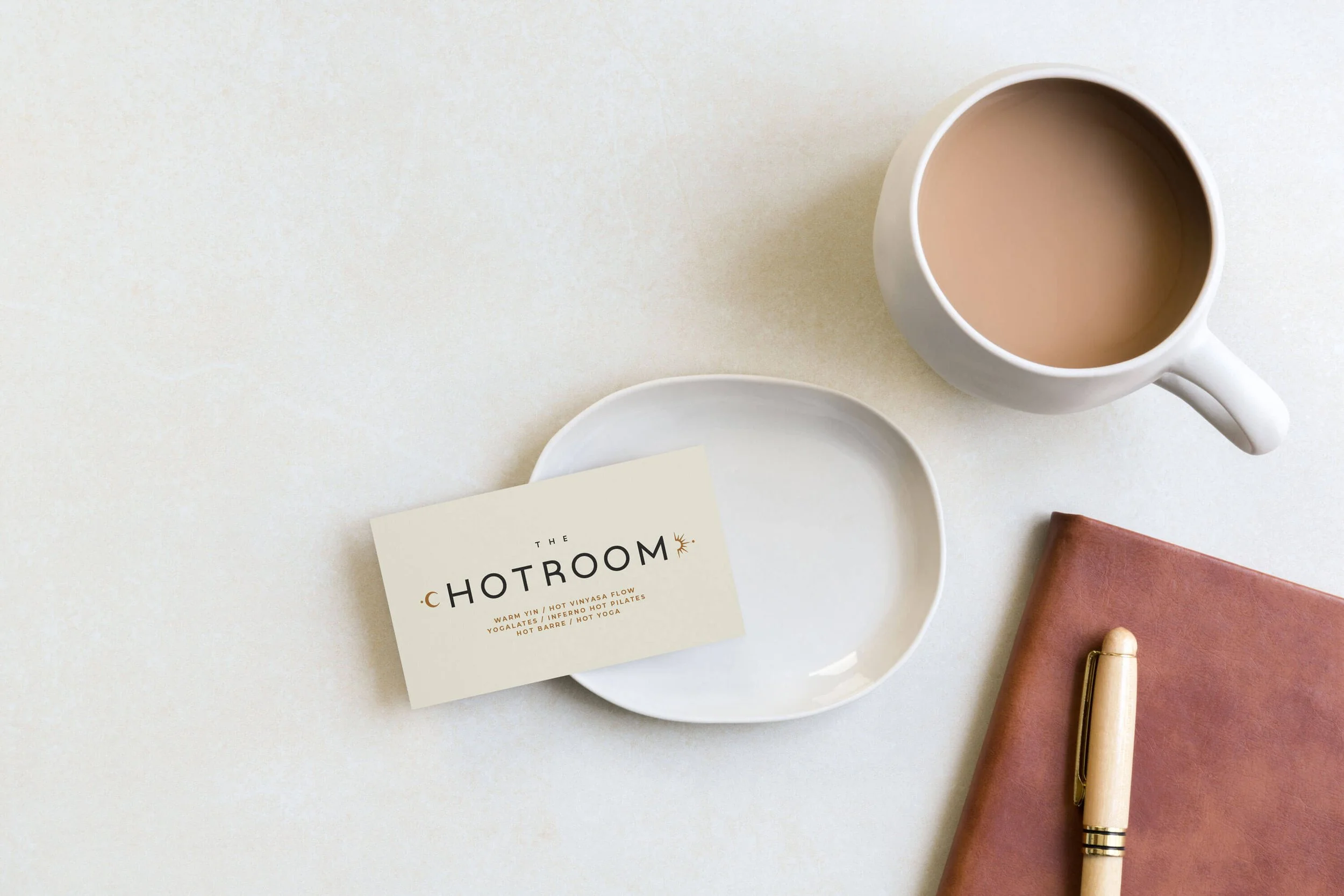
The website and brand offer an inviting entry point to her physical studio, a clear breakdown of teacher expertise and certification programs, a scheduling widget and embedded contact for easy logistics. On the visual front, the identity pulls inspiration from the modern wellness space, utilizing a sophisticated palette of warm tones and calming imagery to establish immediate comfort.
-
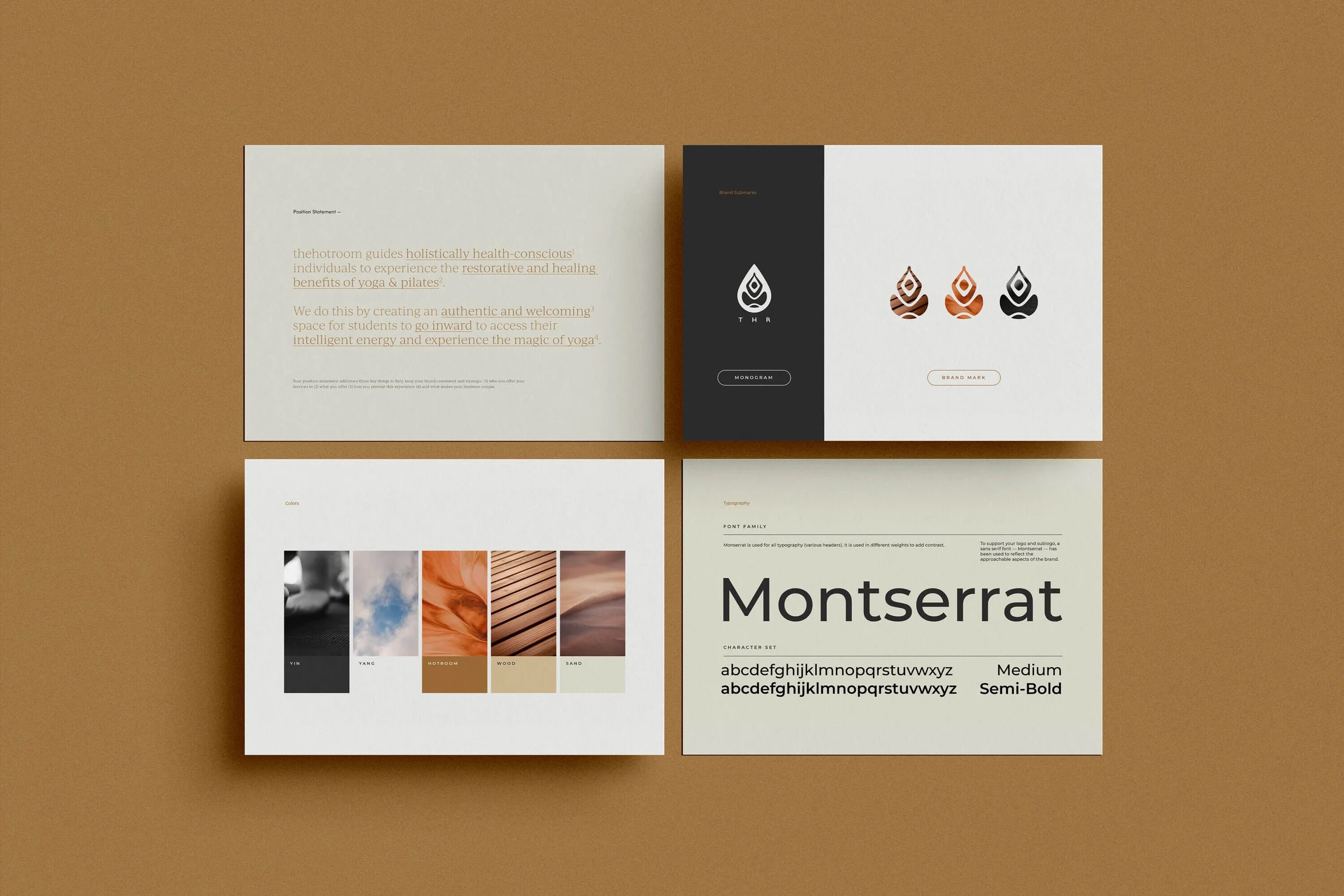
To keep the digital build anchored to Michélè's core mission, we developed an internal vocabulary framework to guide every design and copywriting choice:
The Brand Vibe: Consistent, welcoming, transformative, experienced, and highly balanced.
The Emotional Landscape: Warm, inviting, and peaceful—acting as a familiar sanctuary away from external chaos.
The Brand in a Word: Yoga is magic.
The Strategic Narrative: Moving the client's audience from a state of curiosity to absolute practice alignment and professional certification.
-
This was a referral project and the client brought me on board to handle the end-to-end creative direction, brand identity refresh, and responsive web design, crafting a modern digital home built to support their next phase of growth.